Colour Blocking: The Revolution in Interior Design
Colour blocking in interior design is an art that requires understanding and practice. Through the confident use of colour, anyone can transform their space into a vibrant, energetic and stylish oasis. In this article, we will learn what colour blocking is and its basic principles in interior design.

What is Colour Blocking?
Colour blocking is a bold approach in interior design where contrasting blocks of colour are combined to create visually striking spaces. Originally at home in the art world, particularly in the works of Piet Mondrian and other modernist painters, colour blocking has found its way into our homes and is revolutionising traditional design concepts.
Basic Principles of Colour blocking
It’s important to understand and apply the basic principles if you really want to excel in the art of colour blocking. The following principles will help designers and homeowners create balanced, harmonious and visually appealing spaces.
Choosing the Right Colours
- Understanding the colour wheel – The colour wheel is an invaluable tool for colour design. It helps to identify complementary, analogous and contrasting colour schemes.

- Take colour meanings into account – Different colours evoke different emotions and meanings. For example, blue tones have a calming effect, while red tones have a stimulating effect. Choose colours that match the mood you want to create in the room.
- Room function and colour choice – The function of a room can strongly influence the choice of colour. Strong colours are suitable for the living room or kitchen, while soft, calming colours are better suited to the bedroom.

Strong colours work in the living room and kitchen.


Softer colours are used in the bedrooms.
Balanced Colour Intensity
- Mixing strong and subtle tones – A key to the success of colour blocking is the balance between strong and subtle tones. This prevents the room from looking overwhelming.
- Use neutral colours – Neutral colours can act as a buffer between bold colours, providing a visual break and increasing overall appeal.
- Distribution of colours – It is important to distribute the colours in such a way that the balance is maintained. A dominant colour with one or two accent colours often works well.

Considerations on Structure and Material
- Deepness with texture – Textures can add depth and interest to rooms with Color Blocking. For example, a velvet sofa in a bright colour can give a sense of luxury.
- Reflective and matt surfaces – The surface finish, whether reflective or matt, can influence colour perception. Reflective surfaces can make colours shine, while matt surfaces give a muted impression.
- Combining different materials – Combining different materials such as wood, metal or glass can complement and enhance the colour blocking strategy.


Harmony and Contrast
- Harmonious colour combinations – It is important to find the right balance between harmony and contrast. Colours should complement each other, but not clash.
- Contrast for emphasis – Contrasting colours can be used to emphasise a room and draw the eye to important design elements.
- Transition colours – sometimes the introduction of a transition colour can help to combine two contrasting colours, making the overall design more coherent.

Planning and Visualisation
- Moodboards and samples – Before deciding on colours, create mood boards and collect samples. This will help you visualise the final look and ensure that the chosen colours work well together.
- Digital visualisation tools – Use digital tools and applications to experiment with different colour schemes in your space.

How these Colour Blocking Principles can help to Enhance your Space
By applying these principles, anyone can use colour blocking in interior design to create visually stunning and balanced spaces. Colour blocking can be used in various areas, such as walls, ceilings, furniture and decorations, to create colour accents. Combining patterns with colour is also a growing trend, where the focus is on the harmony of the design elements. Although rules can provide guidance, creativity is just as important in interior design as personal preference.
As the New Year starts, you can try the colour blocking technique with the Pantone Color of the Year: Peach Fuzz to use for a fresh new look of your home this 2024.
Frequently Asked Questions
The metal wall decoration is only suitable for indoor use and not for outdoor use or in damp rooms (such as bathrooms or toilets). Iron was used in the production process, which means that the wall sculpture is not weatherproof. Please do not use damp cloths for maintenance so that the material does not come into contact with water, but apply a protective layer of oil instead.
Professionally trained artists with years of professional experience create our unique artworks in their artist workshops. Through direct contact, KunstLoft ensures fair payment and appropriate working conditions for the artists.
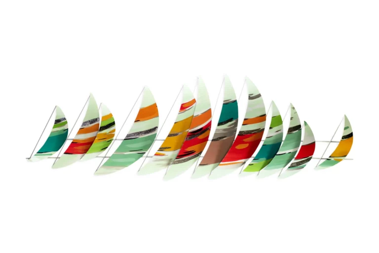
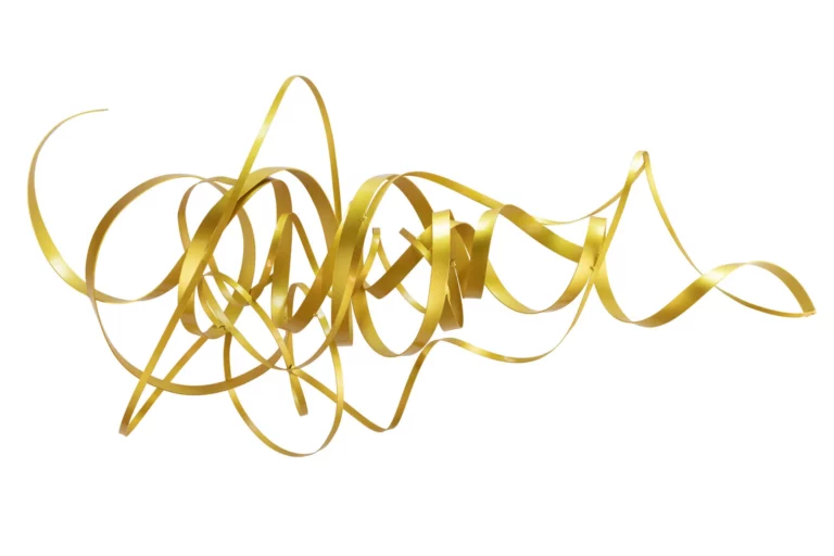
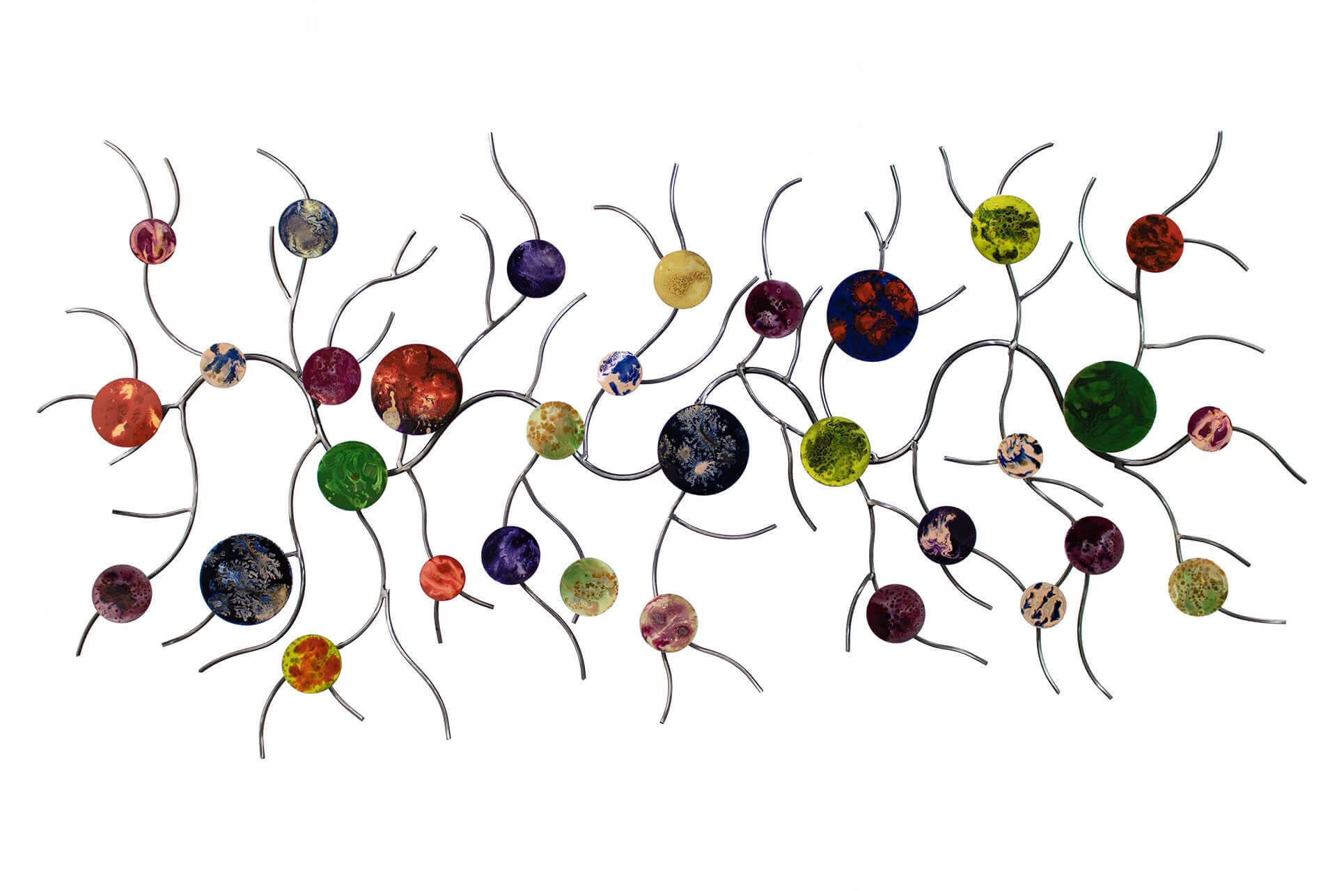
Metal wall decoration
There are eyelets on the back of your metal wall decoration for immediate hanging, allowing it to be attached to the wall vertically, horizontally or at an angle.
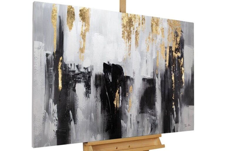
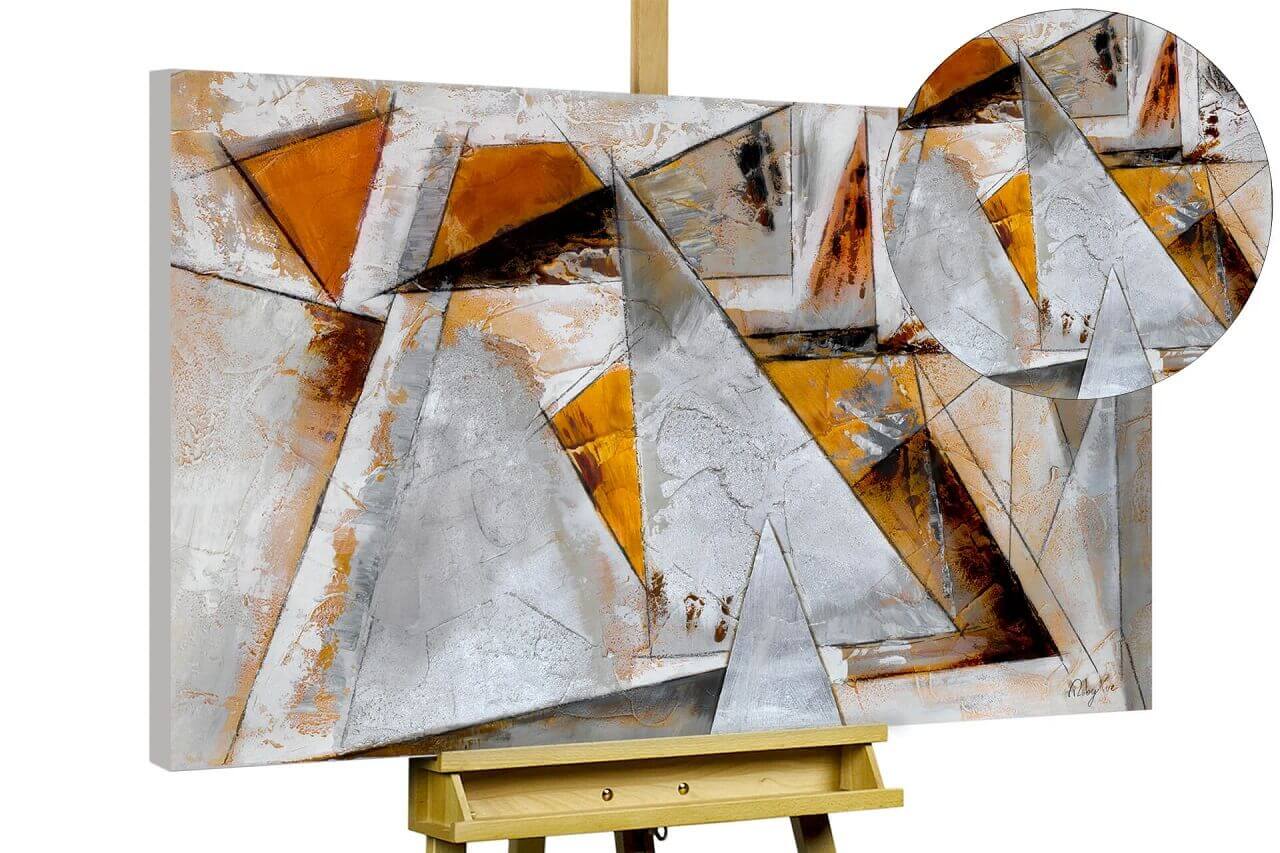
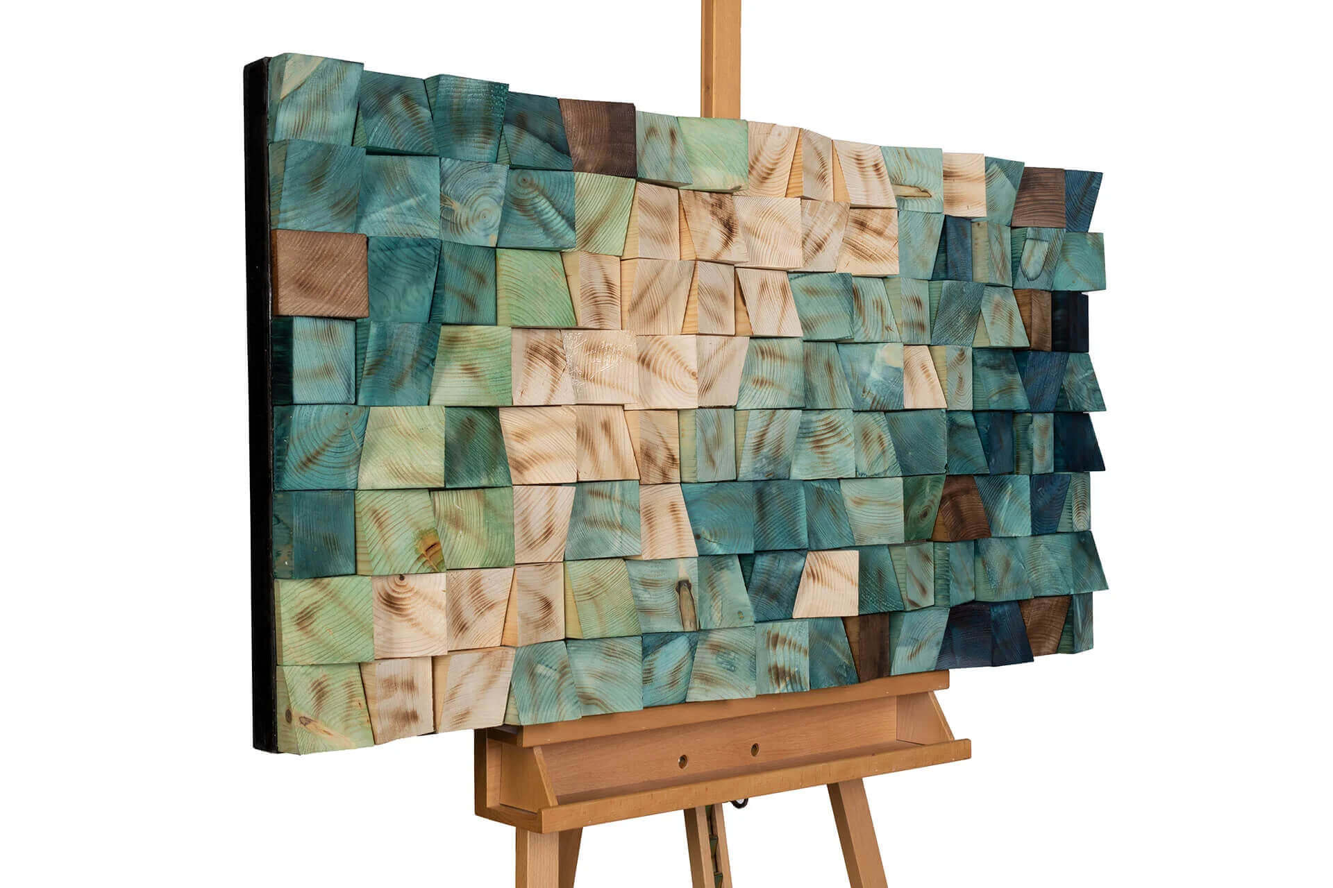
Acrylic glass pictures, Frame Art 3D pictures
These works of art can also be hung up immediately thanks to the spike hangers and holes on the back.
You can find out more about how to easily mount your artwork in our hanging instructions and our explanatory videos.
Image credits: @KunstLoft @Pixabay – Pexels.com @Alan Quirván – Pexels.com @Silver Works – Pexels.com @Antoni Shkraba – Pexels.com @Antony Trivet – Pexels.com @Curtis Adams – Pexels.com @Max Rahubovskiy – Pexels.com